
Related
This entry was posted on December 14, 2021 at 12:21 am and is filed under Statistics with tags bad graph, diet, greenhouse-gas emissions, infographics, jatg, Nature, sustainability. You can follow any responses to this entry through the RSS 2.0 feed.
You can leave a response, or trackback from your own site.
August 4, 2022 at 9:17 am
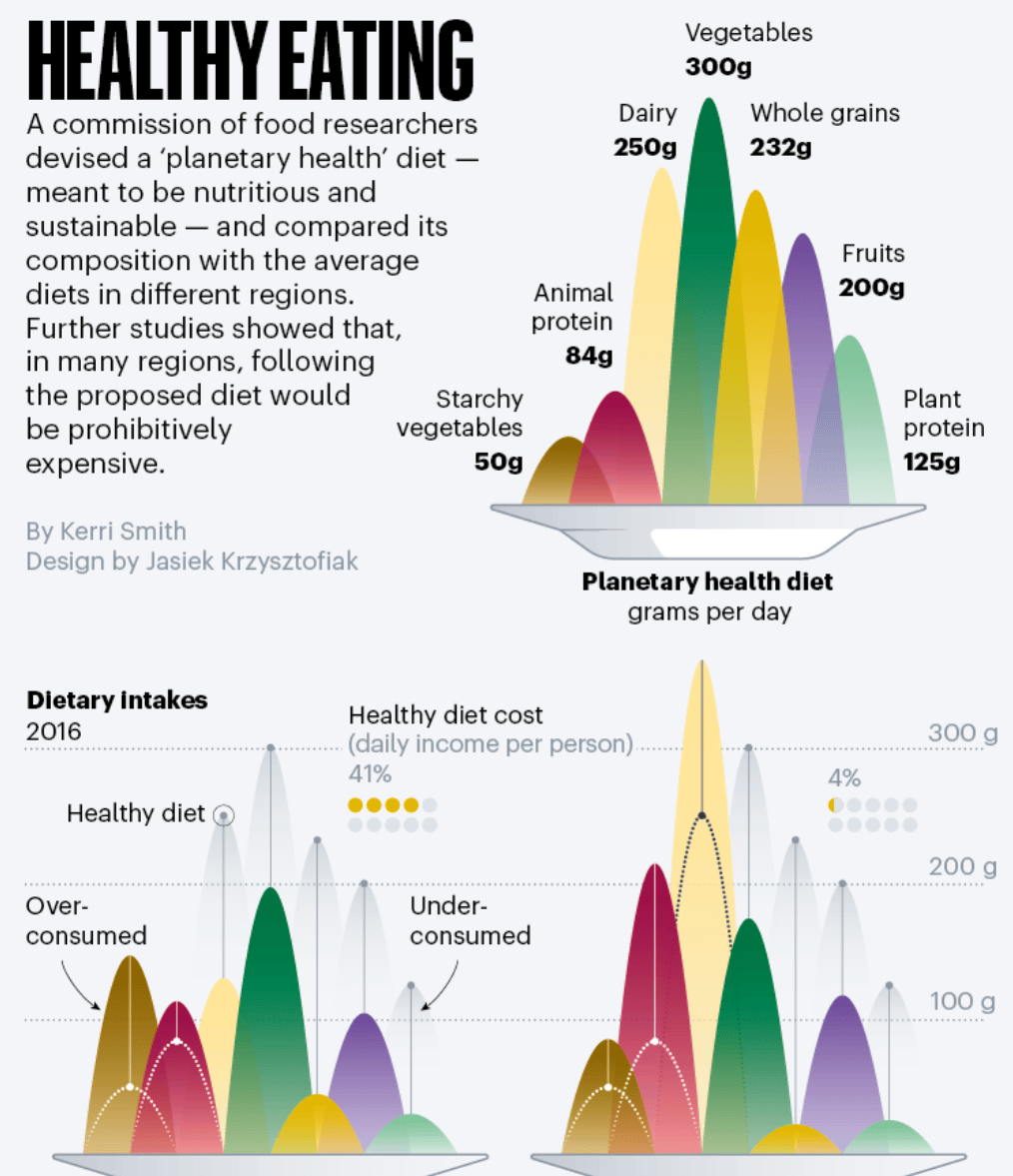
Astoundingly, this graph won an Award of Excellence from the Society for News Design…