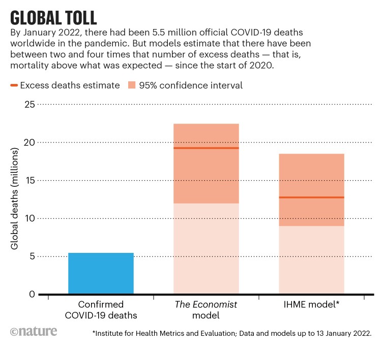
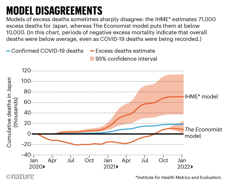
Another terrible graph from Nature… With vertical bars meaning nothing. Nothing more than the list of three values and both confidence intervals. But the associated article is quite interesting in investigating the difficulties in assessing the number of deaths due to COVID-19, when official death statistics are (almost) as shaky as the official COVID-19 deaths. Even in countries with sound mortality statistics and trustworthy official statistics institutes. This article opposes prediction models run by the Institute for Health Metrics and Evaluation and The Economist. The later being a machine-learning prediction procedure based on a large number of covariates. Without looking under the hood, it is unclear to me how poor entries across the array of covariates can be corrected to return a meaningful prediction. It is also striking that the model predicts much less excess deaths than those due to COVID-19 in a developed country like Japan. Survey methods are briefly mentioned at the end of the article, with interesting attempts to use satellite images of burial grounds, but no further techniques like capture-recapture or record linkage and entity resolution.
Archive for infographics
how to count excess deaths?
Posted in Books, Kids, pictures, Statistics with tags bad graph, capture-recapture, COVID-19, death certificate, entity resolution, excess mortality, image analysis, infographics, INSEE, Japan, Jeune economist, Nature, official statistics, record linkage, satellite, The Economist on February 17, 2022 by xi'ananother poor infographics [from Nature, with a warning]
Posted in Books, Statistics with tags COVID-19, India, infographics, Nature, pandemic, UK, USA, variants, waves on December 23, 2021 by xi'an
another terrible infographic [jatg]
Posted in Statistics with tags bad graph, diet, greenhouse-gas emissions, infographics, jatg, Nature, sustainability on December 14, 2021 by xi'an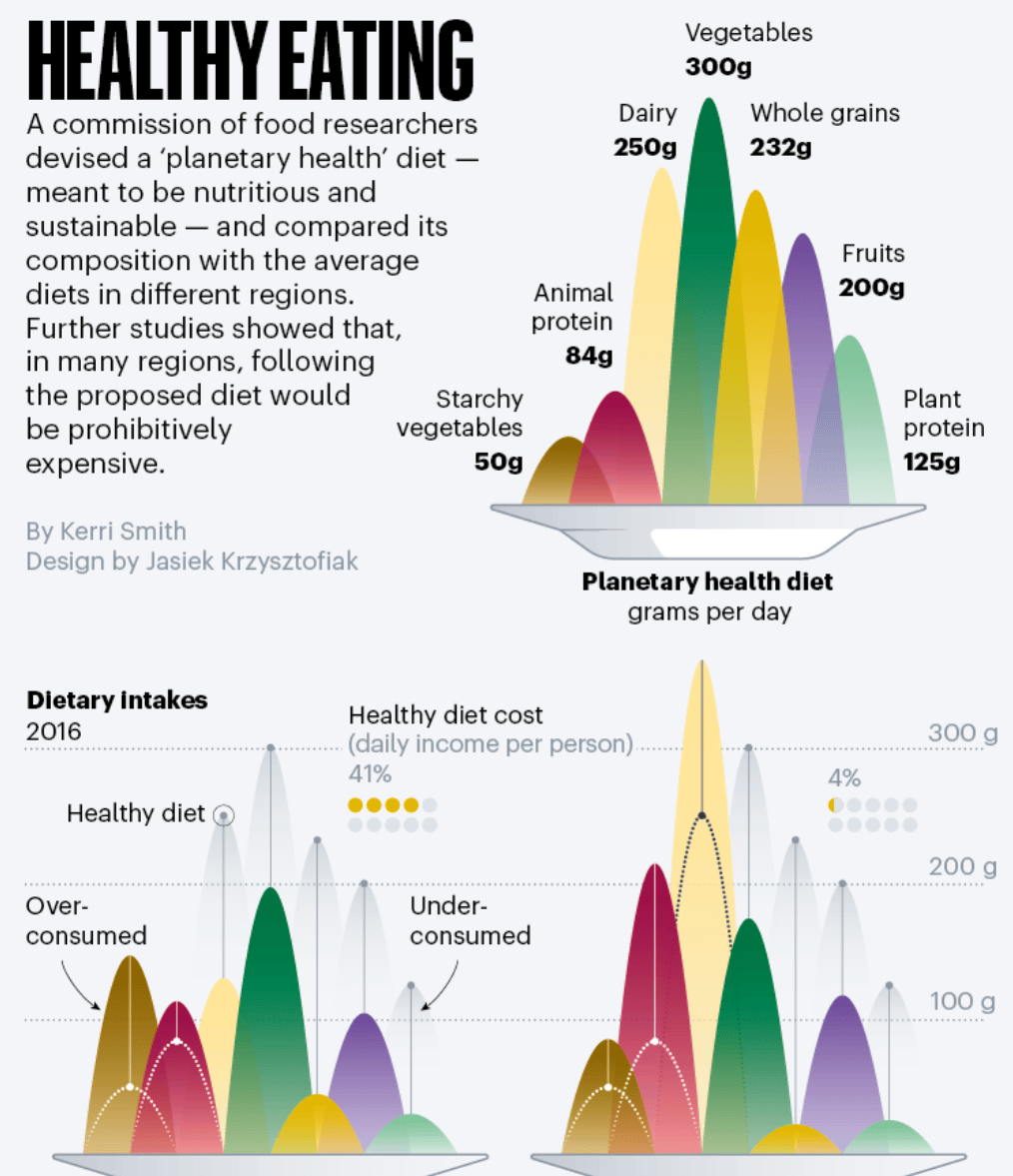
another bad graph
Posted in Books, pictures, Statistics with tags bad graph, COVID-19, infographics, Le Monde, pandemics on October 27, 2021 by xi'an
Venezuelan COVID figures [and Nature infographics of the week]
Posted in pictures, Statistics, Travel with tags COVID-19, excess deaths, health statistics, infographics, Nature, rabies, shoot the messenger, South America, Venezuela on September 22, 2021 by xi'anNature has started a “week in infographics” column with a rather poor panel of figures the first time I checked (single numbers represented by surfaces and so on), but this week shows an unquestionable rendering of the discrepancy between the official COVID-19 death rates in Venezuela and in neighbouring countries. Obviously, there is no reason for all countries to share the same patterns (as seen for instance with the huge difference between France and Germany during the first wave in 2020), especially when considering the economic state of Venezuela, with very few entries from abroad and a general lack of movement throughout the country, but the attached Nature article argues that there is indeed a severe undercounting/reporting. The statistics that exist are actually gathered by a clandestine network of epidemiologists and doctors, with an impossibility to cross-check these as the baseline excess death statistics are not available either. Since 2016. The network responsible for the data collection is clandestine as the scientists involved risk detention or being fired from their position, despite the terrible lack of doctors and medical facilities in the country (which I observed in 2007 when getting an anti-rabies shot proved impossible!)… Another “shoot the messenger” in another dictatorship…